Analyzing simulation results
Depending on the study question, there are different ways to analyze the output of a metaRange simulation. Here we will illustrate a few common biodiversity metrics that can be calculated from species abundance maps, such as species richness and the Shannon diversity index.
# Install and load required packagelibrary(terra)library(here)Calculating Biodiversity Metrics
Section titled “Calculating Biodiversity Metrics”First we need to create some example data. For this we generate three 100 x 100 rasters with random numbers representing abundances for three species.
# Create empty raster templater_template <- rast(nrows=100, ncols=100, xmin=0, xmax=100, ymin=0, ymax=100)
# Simulate abundances for 3 species by drawing from a Poisson distribution# and assigning to raster cellsset.seed(123)sp1 <- rast(r_template)values(sp1) <- rpois(ncell(sp1), lambda = 3)
sp2 <- rast(r_template)values(sp2) <- rpois(ncell(sp2), lambda = 2)
sp3 <- rast(r_template)values(sp3) <- rpois(ncell(sp3), lambda = 1)
# Combine into a single SpatRaster with different layers per speciesabundance <- c(sp1, sp2, sp3)names(abundance) <- c("species_1", "species_2", "species_3")
# Visualizeplot(abundance, type = "continuous")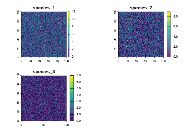
From this data, we can now calculate different biodiversity metrics.
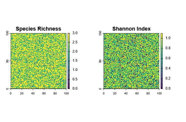
Species Richness
Section titled “Species Richness”Species richness is defined as the number of species in an area, which in this case mean each grid cell. Therefore, it is very easy to calculate from the abundance rasters:
# Calculate richness per cellrichness <- sum(abundance > 0)plot(richness, main = "Species Richness", type = "continuous")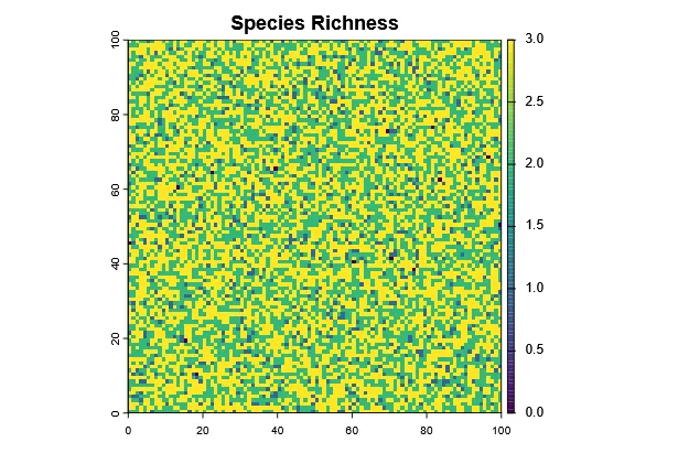
Shannon Diversity Index
Section titled “Shannon Diversity Index”The Shannon index (H’) uses not only the richness, but also the relative abundance (evenness) of each species to calculate diversity. It has no direct “unit”, as the species richness itself does, but is rather a measure of the question: “If I randomly pick an individual from this site, how (un)certain am I about which species it belongs to?”. A higher Shannon index indicates more diversity (more species and / or more even abundances).
piis the proportion (relative abundance) of species i at a siteSis the total number of species at a site
The code to calculate the Shannon index per cell is as also straightforward:
shannon <- function(x) {  x <- x[x > 0]  p <- x / sum(x)  -sum(p * log(p))}
# Apply function across all cellsshannon_index <- app(abundance, shannon)plot(shannon_index, main = "Shannon Diversity Index")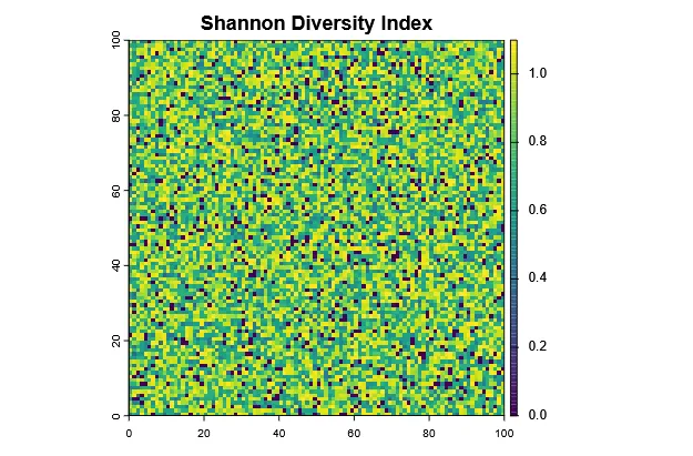
Now we can compare how richness and Shannon index differ across the landscape:
par(mfrow=c(1,2))plot(richness, main="Species Richness")plot(shannon_index, main="Shannon Index")par(mfrow=c(1,1))Evidently, they are correlated, but not the same.
Time series Analysis
Section titled “Time series Analysis”One can not only calculate biodiversity metrics for a single time step, but also across a time series.
We can illustrate this with an example where we have abundance maps for two species across 10 time steps (e.g. years).
For this, we create .tif files, that represent a species abundance map at one year.
tutorial_folder_name <- "analyze_biodiv_data"dir.create(file.path(here(), tutorial_folder_name))dir.create(file.path(here(), tutorial_folder_name, "raw_data"))raw_path <- file.path(here(), tutorial_folder_name, "raw_data")
# Create raster templater_template <- rast(nrows=50, ncols=50, xmin=0, xmax=100, ymin=0, ymax=100)
set.seed(42)
# Function to generate abundance rasters for each time stepgenerate_species_time_series <- function(species_name, start_base_abundance) {  for (t in 1:10) {    # copy raster template    r <- rast(r_template)    # random variation over time    values(r) <- rpois(ncell(r), lambda = start_base_abundance + sin(t/2) * start_base_abundance/3)    filename <- sprintf("%s-abundance_%02d.tif", species_name, t)    # save the file    writeRaster(r, file.path(raw_path, filename), overwrite = TRUE)  }}
# Generate time series for two speciesgenerate_species_time_series("species_A", start_base_abundance = 15)generate_species_time_series("species_B", start_base_abundance = 8)
Now, we can load the time series back into R
For this, terra::sds() can be used to group all .tif files for each species into one object (i.e. a collection of 3D rasters).
# List filesspecies_A_files <- list.files(raw_path, pattern = "species_A.*tif$", full.names = TRUE)species_B_files <- list.files(raw_path, pattern = "species_B.*tif$", full.names = TRUE)
# Create the SpatRasterDataset (time series per species)abundance_timeseries <- sds(  list(    species_A = rast(species_A_files),    species_B = rast(species_B_files)  ))abundance_timeseries#> class       : SpatRasterDataset#> subdatasets : 2#> dimensions  : 50, 50 (nrow, ncol)#> nlyr        : 10, 10#> resolution  : 2, 2  (x, y)#> extent      : 0, 100, 0, 100  (xmin, xmax, ymin, ymax)#> coord. ref. :#> source(s)   : species_A-abundance_01.tif, species_A-abundance_02.tif, ...#> names       : species_A, species_B
Now abundance_timeseries$species_A and abundance_timeseries$species_B are both SpatRaster with 10 layers (one per time step).
Plot Total Abundance Over Time
Section titled “Plot Total Abundance Over Time”The most basic thing we can do with this is to plot how total abundance changes over time for each species.
# Calculate total abundance per species per time stepsum_A <- global(abundance_timeseries$species_A, "sum")$sumsum_B <- global(abundance_timeseries$species_B, "sum")$sum
# Combine into data frametime <- 1:10abundance_df <- data.frame(time, species_A = sum_A, species_B = sum_B)
# Plotplot(time, abundance_df$species_A, type = "l", lwd = 2, col = "darkgreen",     ylim = range(abundance_df), ylab = "Total abundance", xlab = "Time step",     main = "Total abundance over time")lines(time, abundance_df$species_B, col = "blue", lwd = 2)legend("topright", legend = c("Species A", "Species B"),       col = c("darkgreen", "blue"), lwd = 2)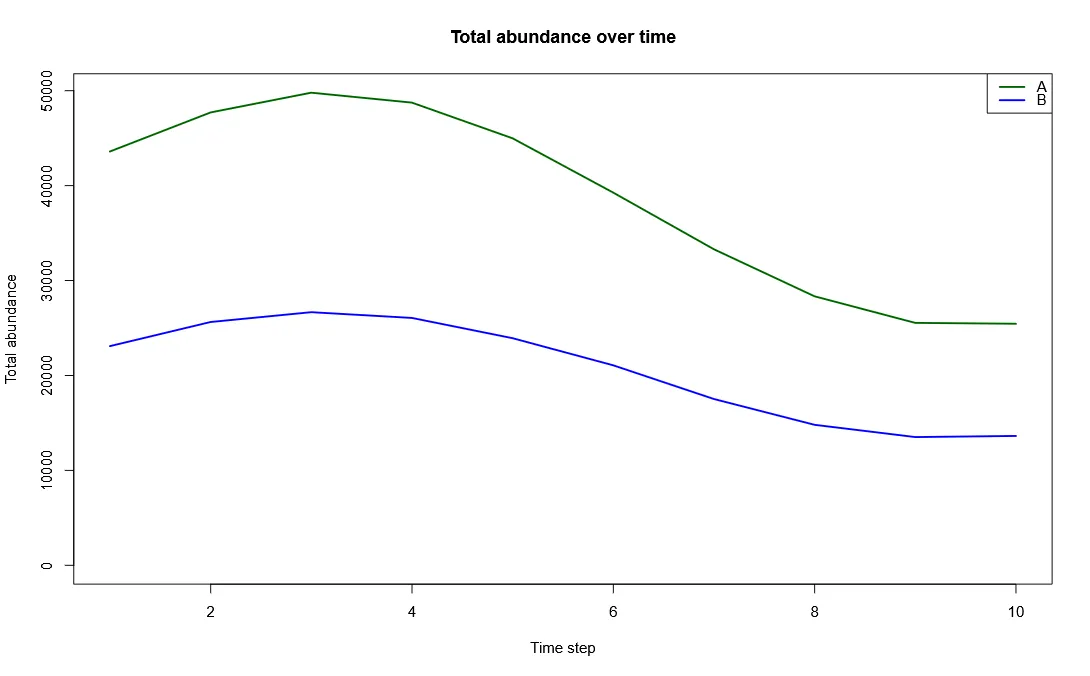
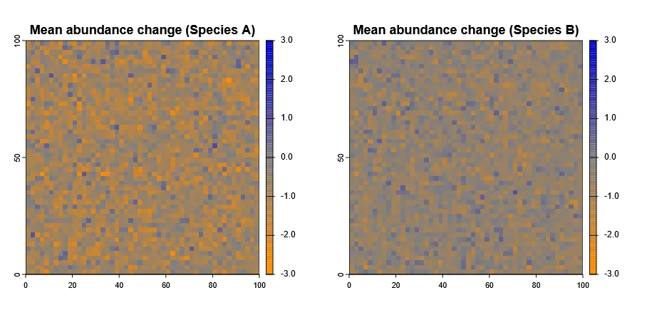
Identify Areas of Population Increase / Decrease
Section titled “Identify Areas of Population Increase / Decrease”More interestingly, we can also identify areas where populations are increasing or decreasing over time.
To do this we need to calculate the mean lagged difference across time steps per cell.
Luckily, terra already has a built-in diff() function.
# Calculate mean lagged difference for each species (between each layer)mean_diff_A <- diff(abundance_timeseries$species_A)mean_diff_B <- diff(abundance_timeseries$species_B)
# now get the meanmean_diff_A <- mean(mean_diff_A)mean_diff_B <- mean(mean_diff_B)
# Plotpar(mfrow=c(1,2))
# custom color paletteplot_colors <- hcl.colors(20, palette = "Green-Brown", rev = TRUE)pal <- colorRampPalette(c("darkorange", "grey50", "blue3"))lim <- max(abs(global(mean_diff_A, range, na.rm=TRUE)))lim <- max(lim, abs(global(mean_diff_B, range, na.rm=TRUE)))breaks <- seq(-lim, lim, length.out = 20)
plot(mean_diff_A, main="Mean abundance change (Species A)", col=pal(100), breaks=breaks, type ="continuous")plot(mean_diff_B, main="Mean abundance change (Species B)", col=pal(100), breaks=breaks, type ="continuous")par(mfrow=c(1,1))